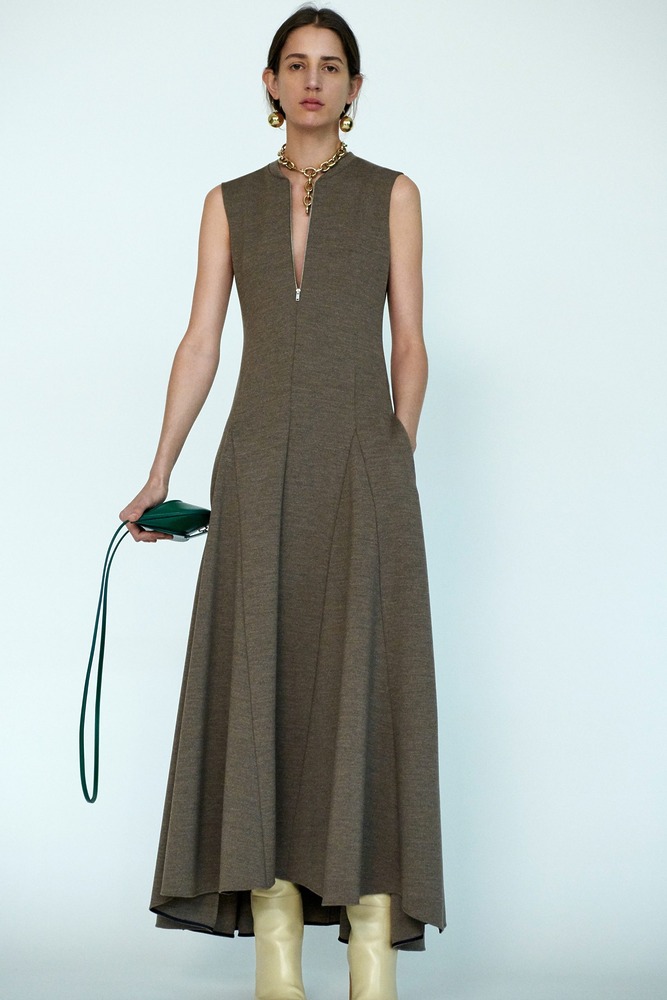
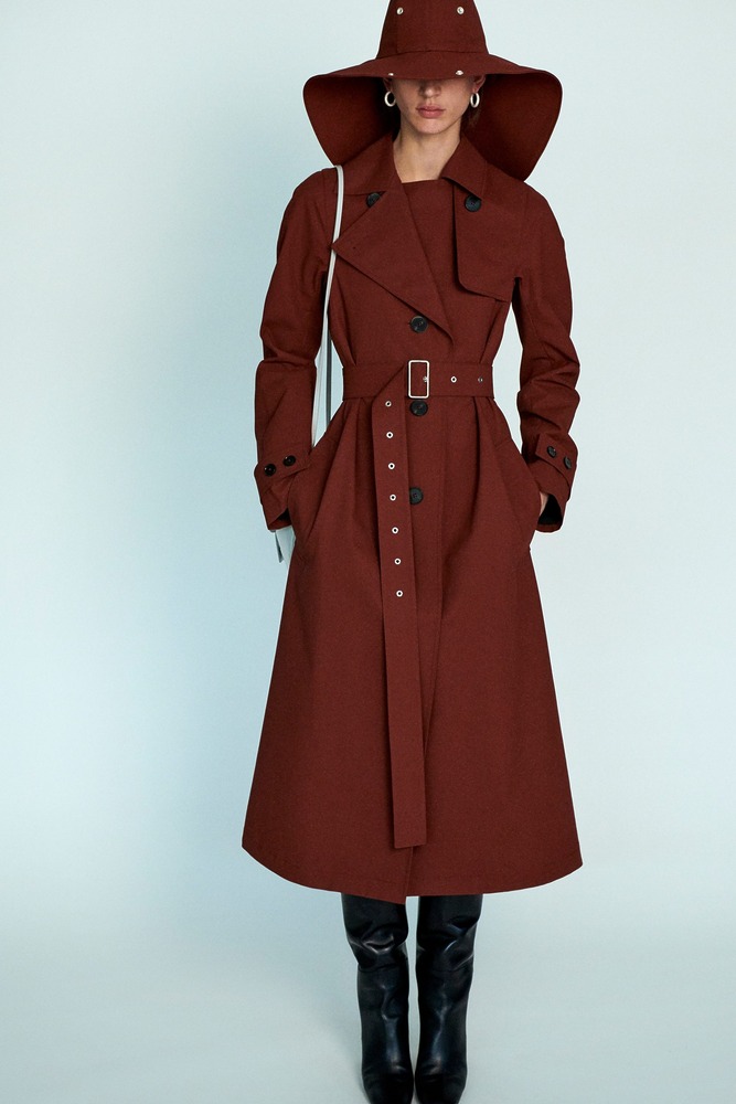
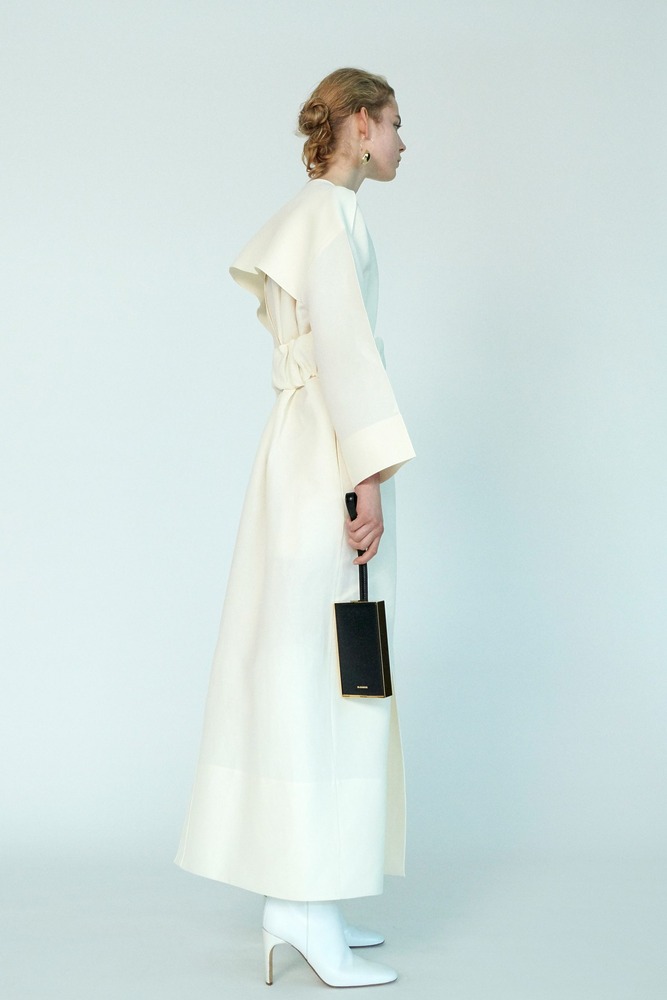
JIL SANDER PRE-FALL 2020 COLLECTION
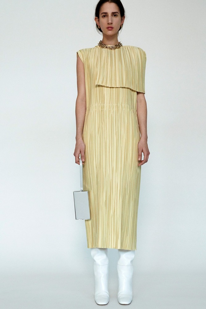
A dialogue of co-dependent opposites runs through the Pre-Fall collection.
December 3, 2019
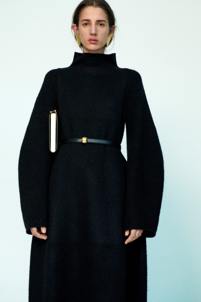
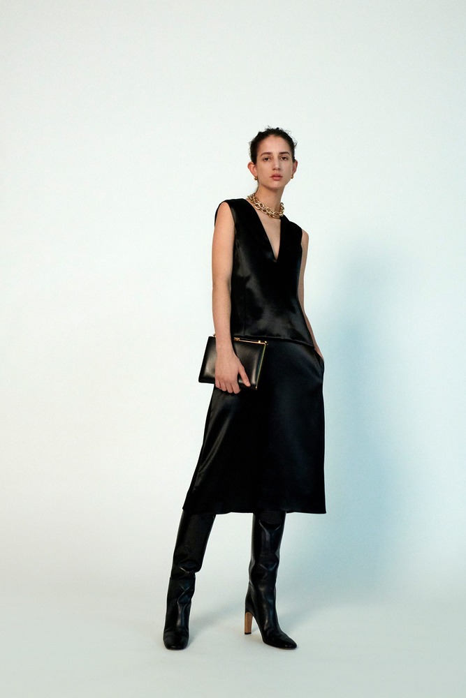
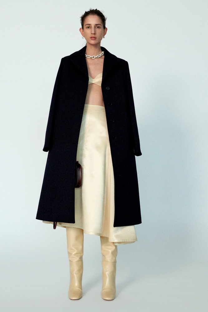
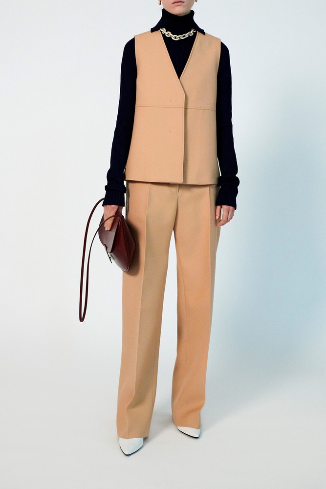
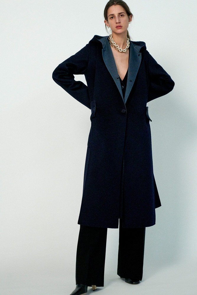
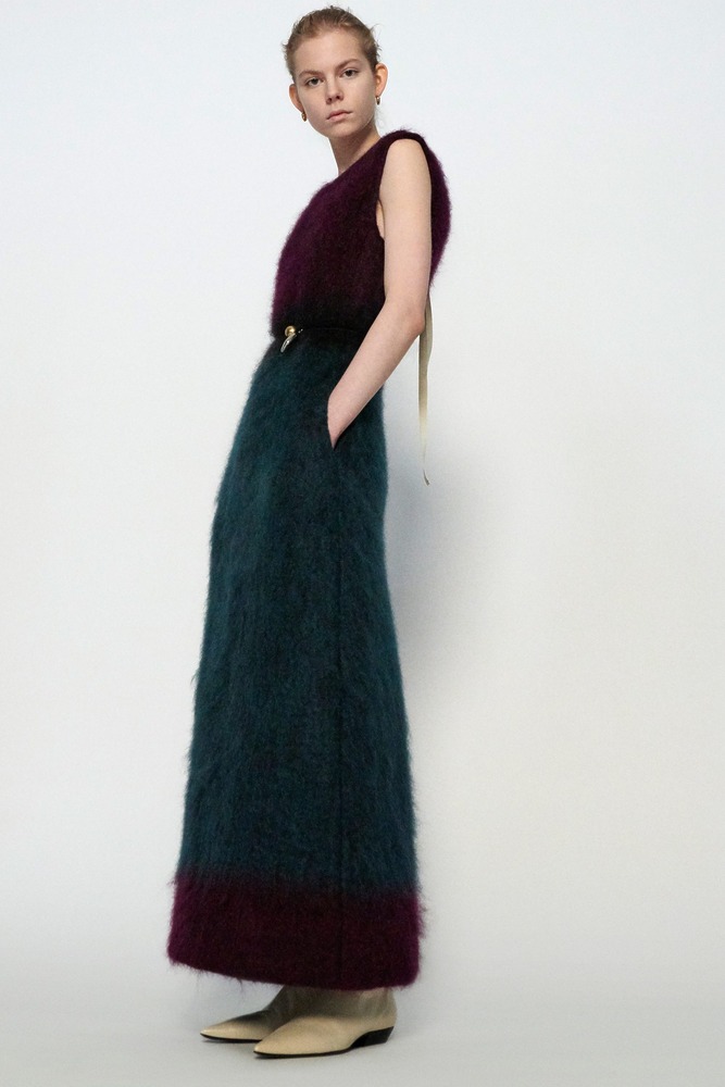
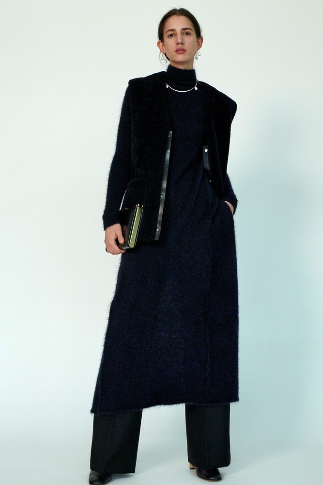
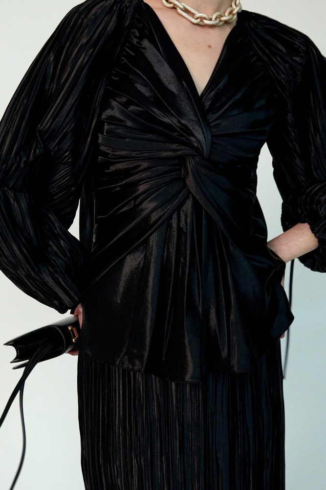
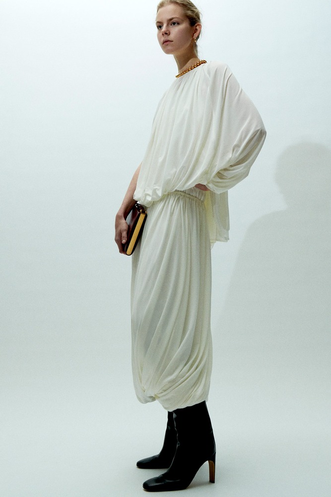
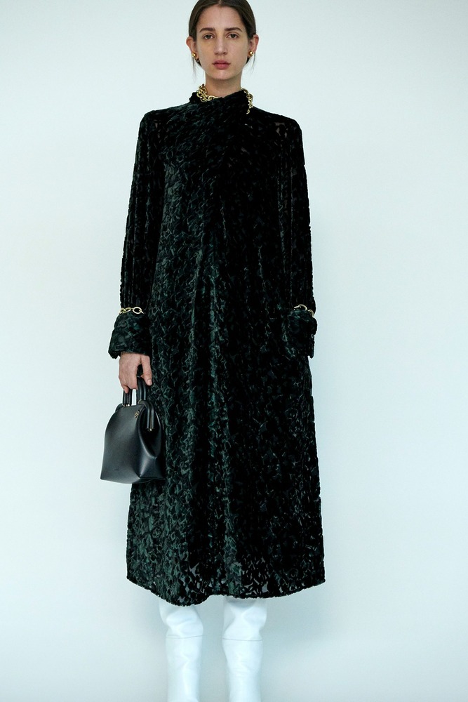
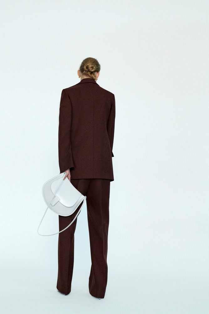
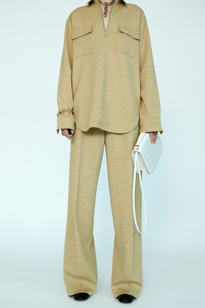
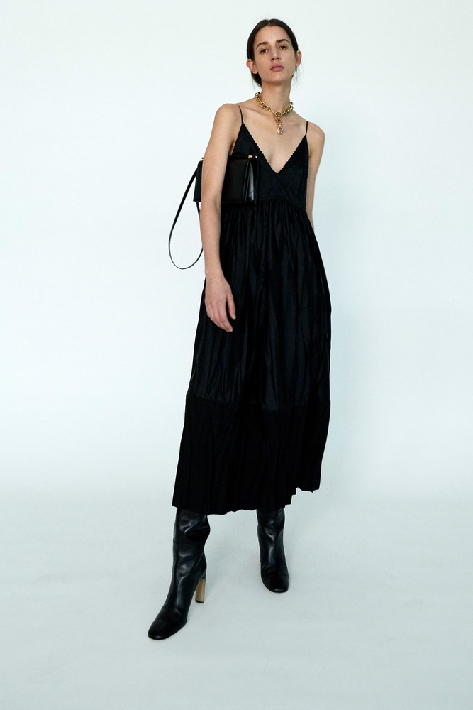
Creative Directors and husband and wife duo, Luke and Lucie Meier’s vision for Jil Sander is evolving with confidence, balancing act of precision and grace, severity and indulgence. A few unnecessary hard edges have been cleverly smoothed, and the Jil Sander Pre-Fall 2020 proved to be a rather serene negotiation between restraint and release.
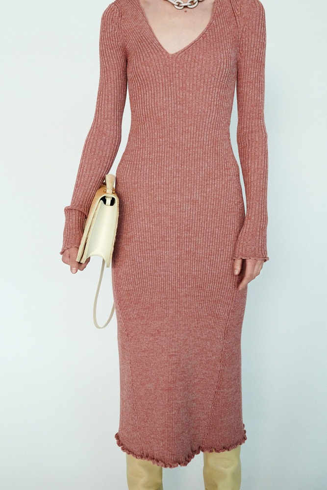
Tinged with an artsy appreciation for craft and a mindful, cultivated attitude, their version of the label’s minimalist roots is progressively becoming warmer and more expressive. Even a certain sensuality and a fluidity, aspects not usually associated with such rigorous aesthetics, are now creeping in.
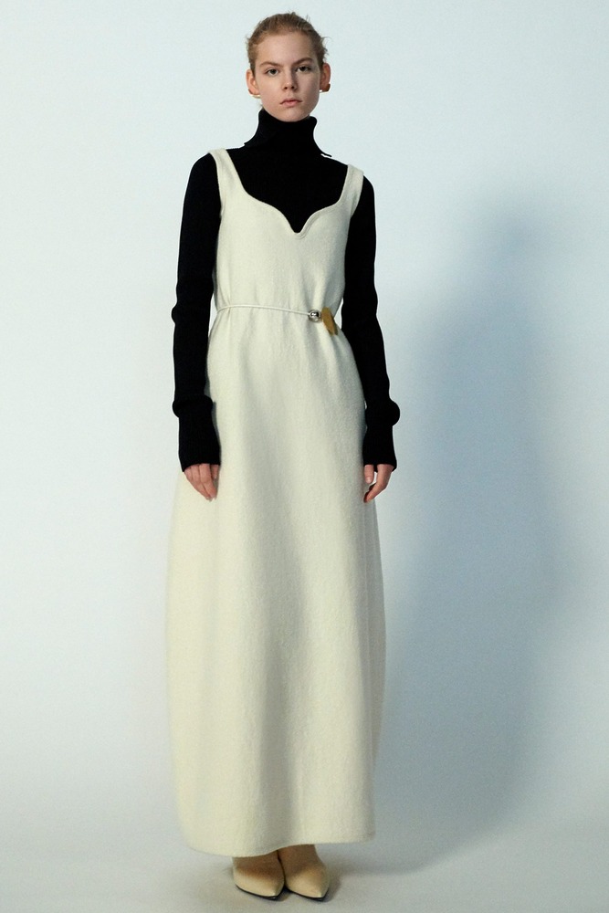
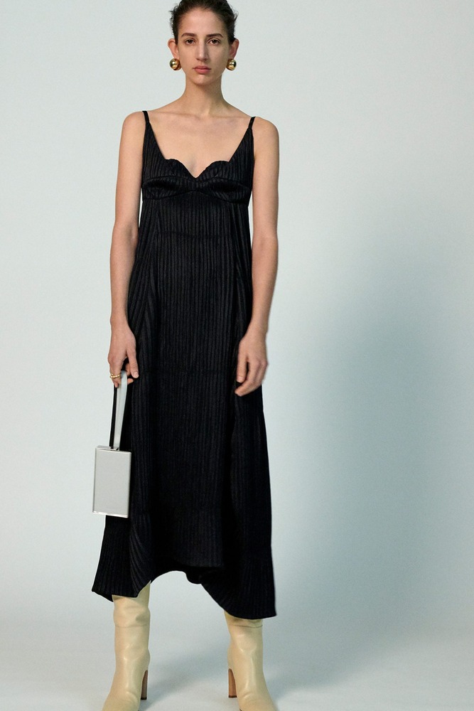
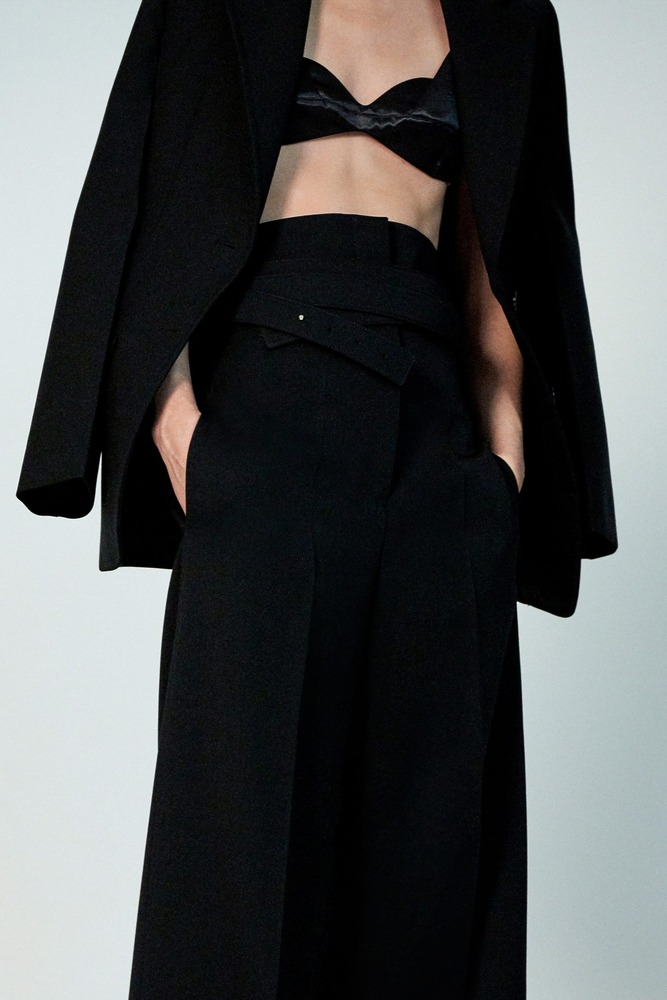
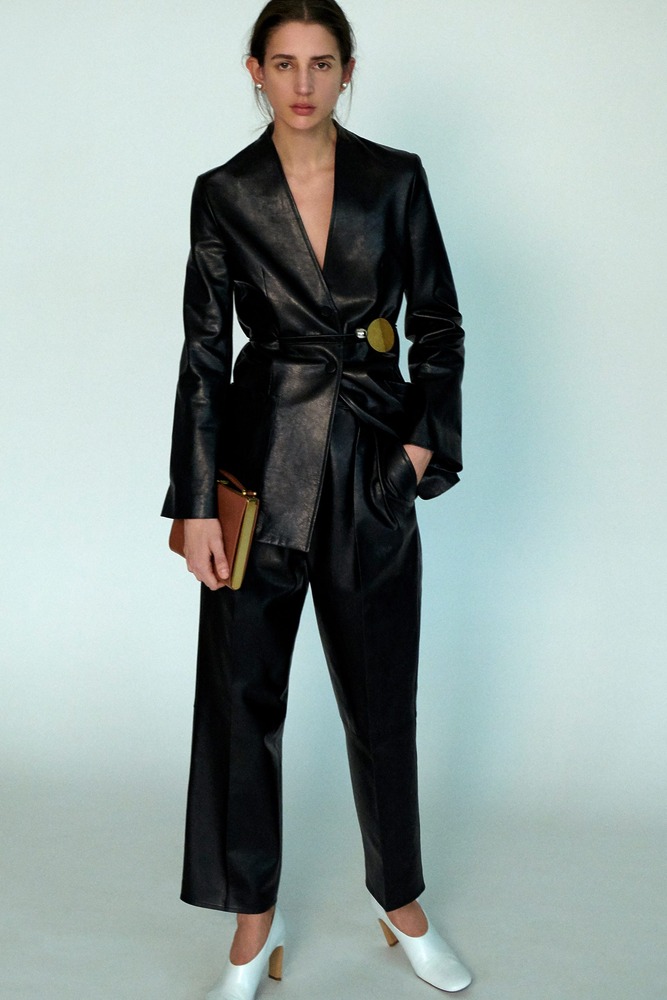
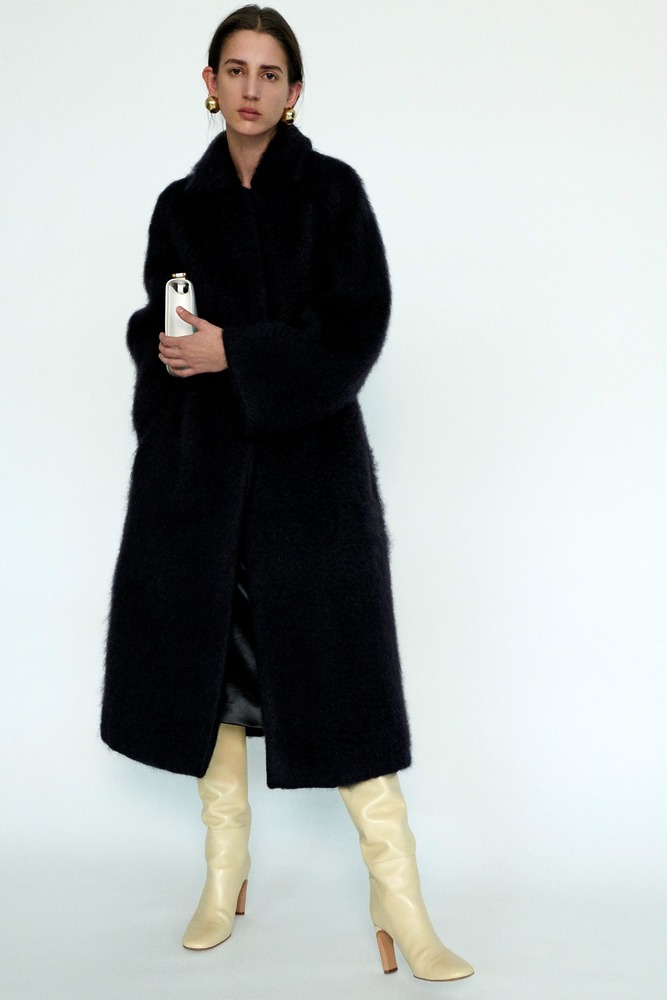
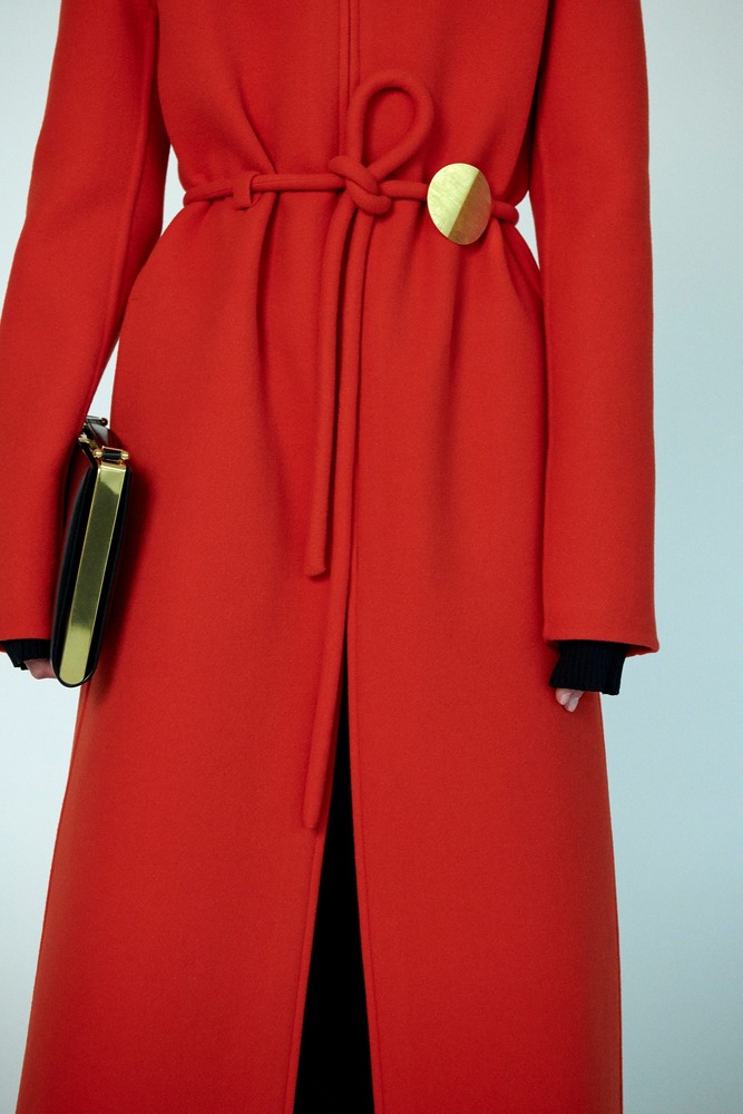
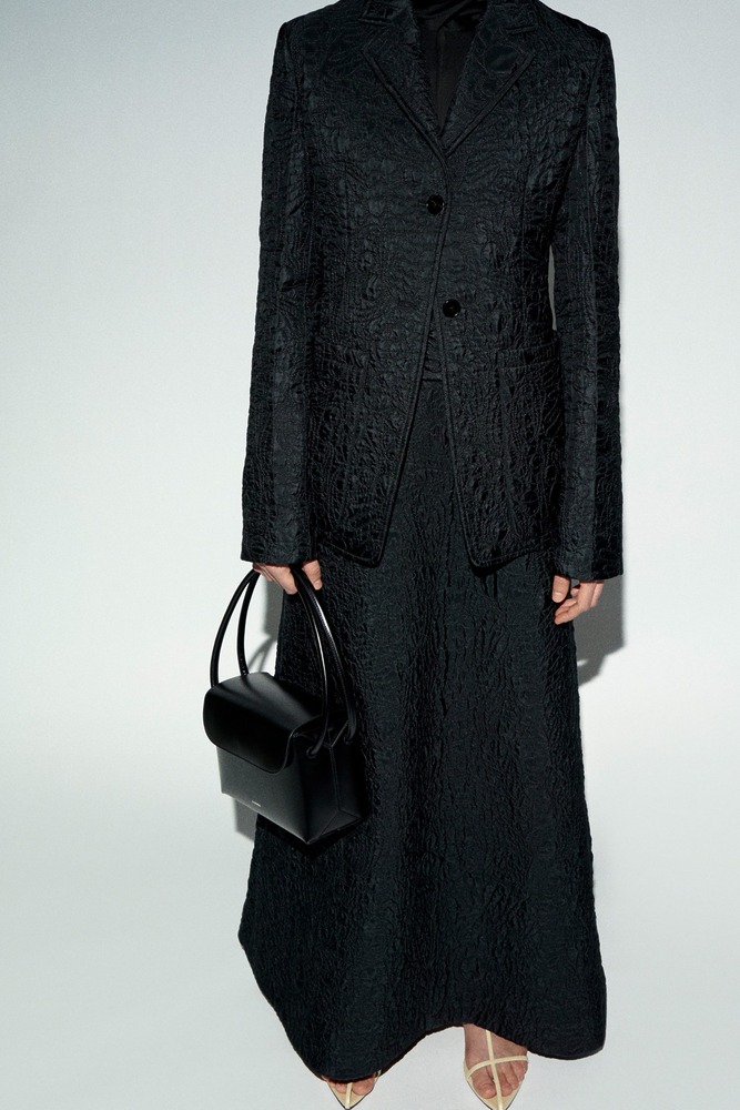
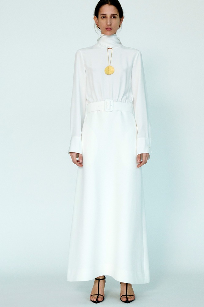
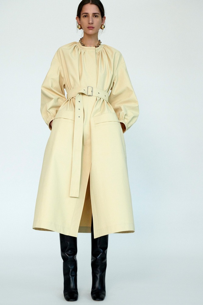
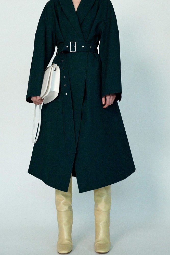
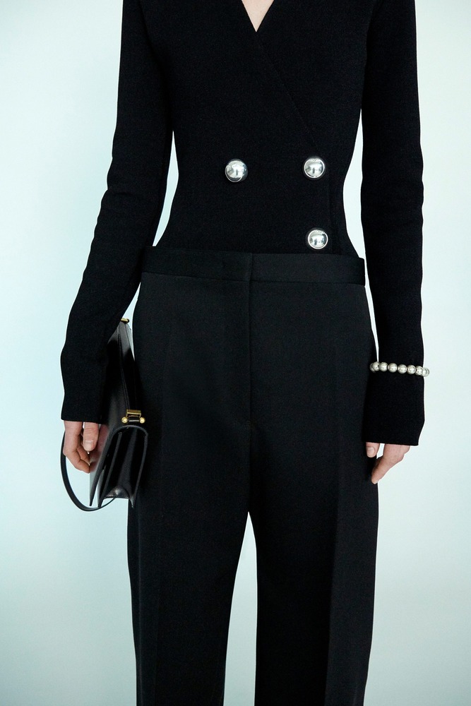
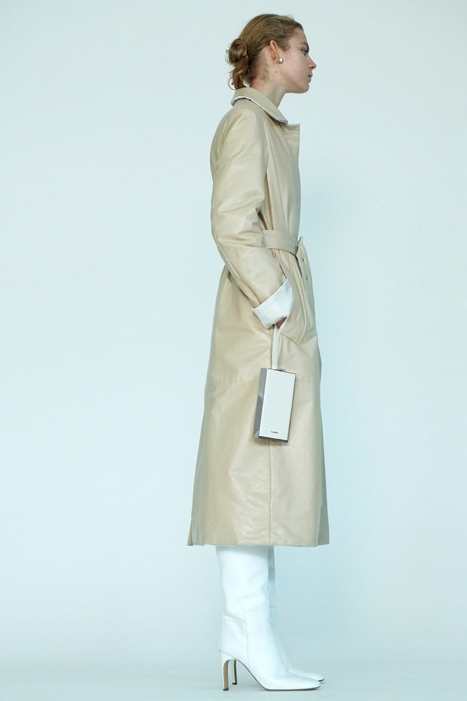
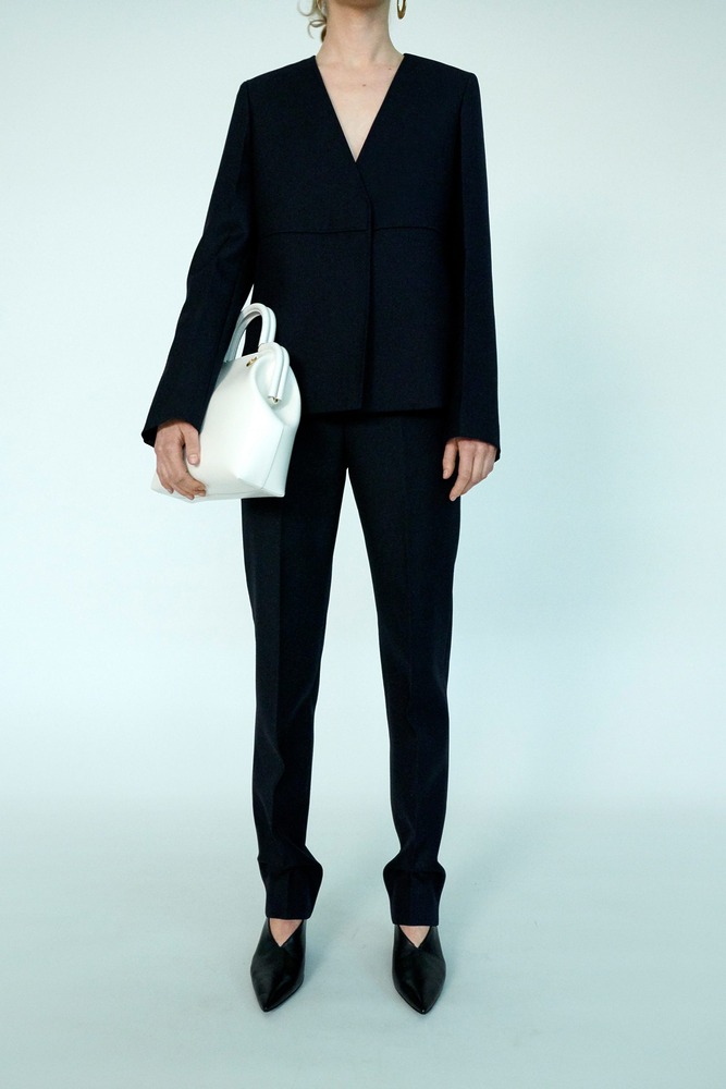
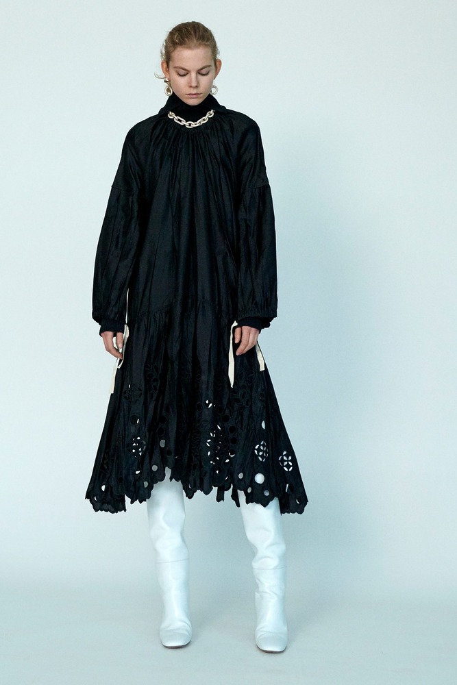
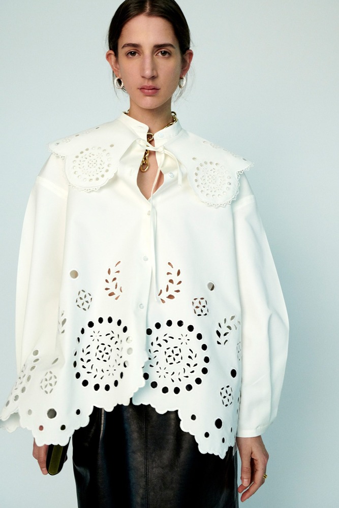
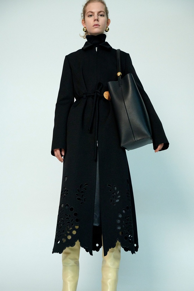
Cases in point were the feminine lines of the décolletages, borrowed from corsetry and delicately lined with inconspicuous embroideries. Jewelry was another seductive touch: Waists were cinched with thin belts featuring round silver buckles and the angular lines of coats and sharp-cut blazers were decorated with bold jewel-like silver buttons. Along the same subtly imaginative lines, the hem of a slender black overcoat and the scalloped edges of a ruched white blouse were laser-cut into feminine Broderie Anglaise motifs.
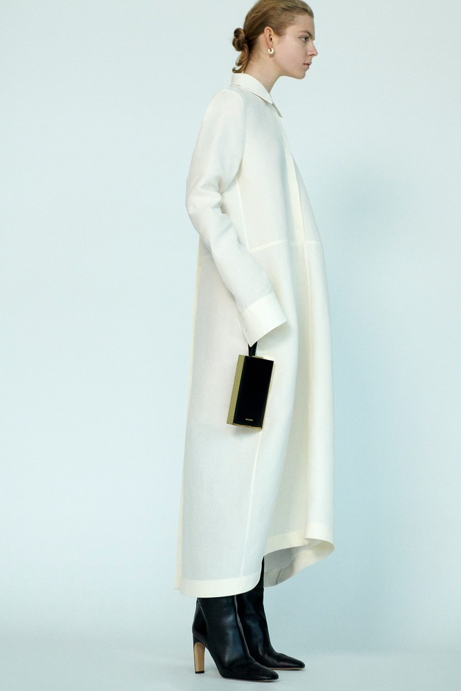
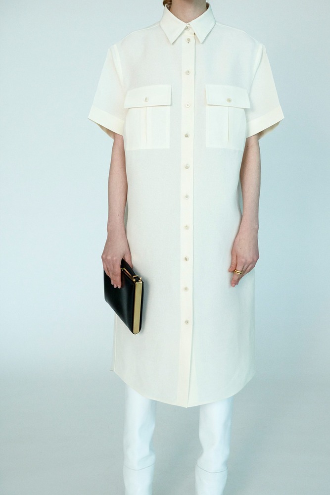
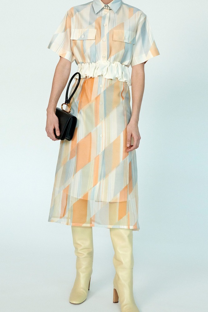
Further highlighting the yin-yang subtext of the Meiers’ creative vision, a series of shirtdresses was offered in roomy, precise shapes, crisply cut in an organic banana fibre fabric. “Shirtdresses are important to us, as they are the perfect synthesis of the masculine and the feminine,” they explained.
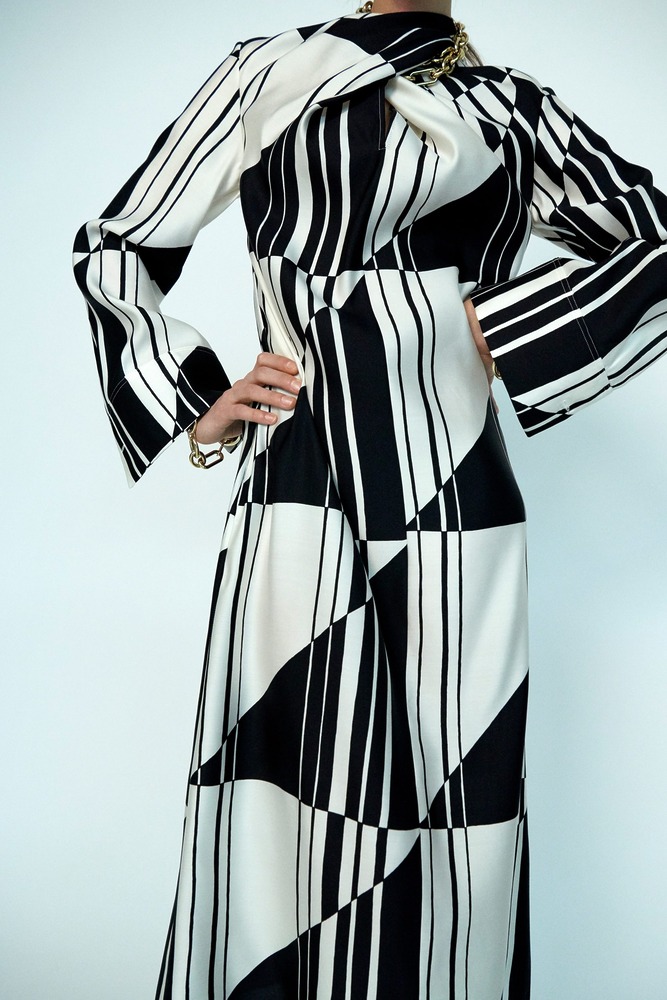
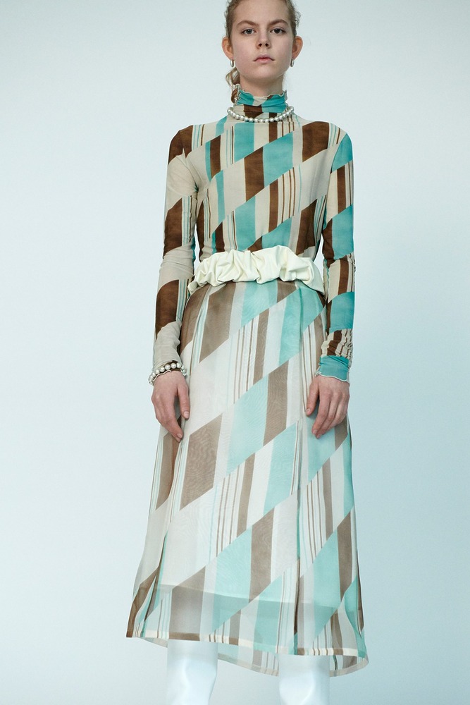
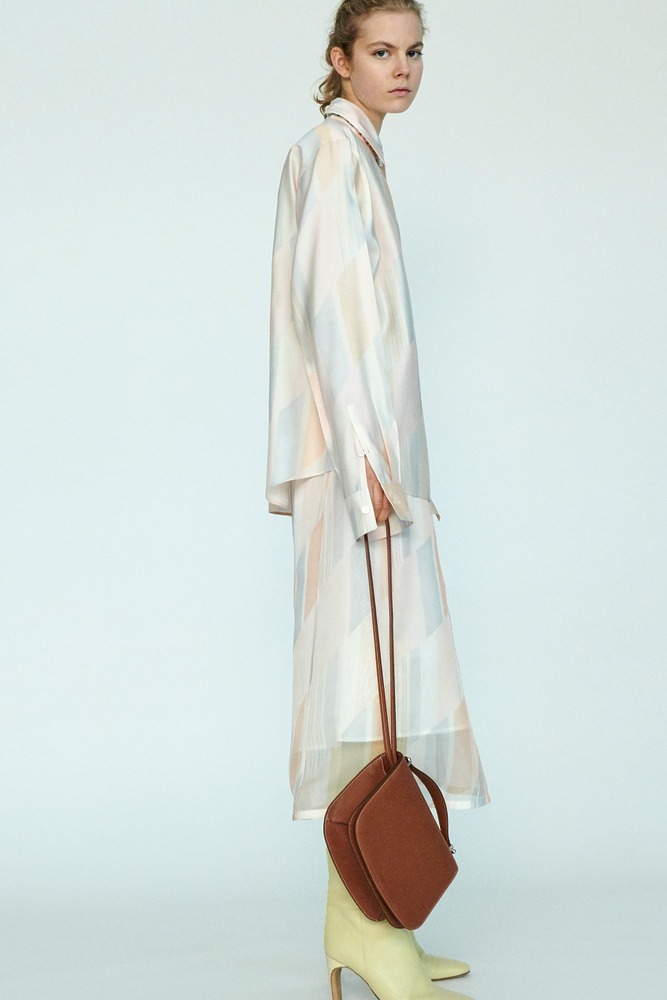
Recently the designers have been fascinated by the Viennese Secession movement, extensively researching the work of Wiener Werkstätte’s artists like Joseph Hoffmann, Koloman Moser, and the textile designer Maria Lucia Stadlmayer. For Pre-Fall, Stadlmayer’s graphic patterns were reproduced in their original proportions and colors on sheer organza layers, juxtaposed over sharp-cut silk twill or silk jersey shirts, skirts, and tunics, inducing a slightly kinetic, blurred chromatic effect.
“We used the motifs on their authentic scale, because you have permission from the archives in Vienna to reproduce them only in the exact proportions and colors she intended to use,” they said. “We really cared about keeping the integrity of the design; we didn’t want to appropriate them in the wrong way.”
